Take-home design exercise · Lumion
Contacts, redesigned around the student lifecycle
Today the Contacts pages behave like an address book: a name, a phone, an email, a date added. Lumion's promise is different, the entire student lifecycle, on one record. So the redesign makes the list a pipeline workspace, where every row shows stage, time in stage, and the next step, and makes the record a 360° view that opens on what to do next rather than on empty fields.
Brian Fromm · September 2026
Contacts list
Saved views with live counts, lifecycle columns, visible filters, a duplicate banner, and quick actions on every row. Opens sorted by recency so the top of the list is what is happening now.
Try: switch between the saved views along the top; hover a row for call, text, and email; tick a few rows to raise the bulk bar; open Filter or the columns picker; click a column header to sort.
Open the list Prototype 2Contact record (David Kim)
A summary strip with stage, likelihood, responsiveness, balance, and next step. Mia's read with a recommendation and evidence. A composer, a unified timeline, and a compact rail for journey, tasks, details, and money.
Try: in Mia's read, click "Draft the text"; switch the composer tabs; filter the Activity feed and move between tabs; use the Approve split button; open the More menu and choose Delete to see the safer archive flow.
Open the recordDesign rationale
What I found in the current pages, who they serve, the principles behind each change, how I would measure it, how I would ship it, and the questions I would ask the Lumion team first.
Before and after
Same screens at the same width. Before is the HTML you sent; after is the prototype above. Both are rendered at 1440 pixels wide.
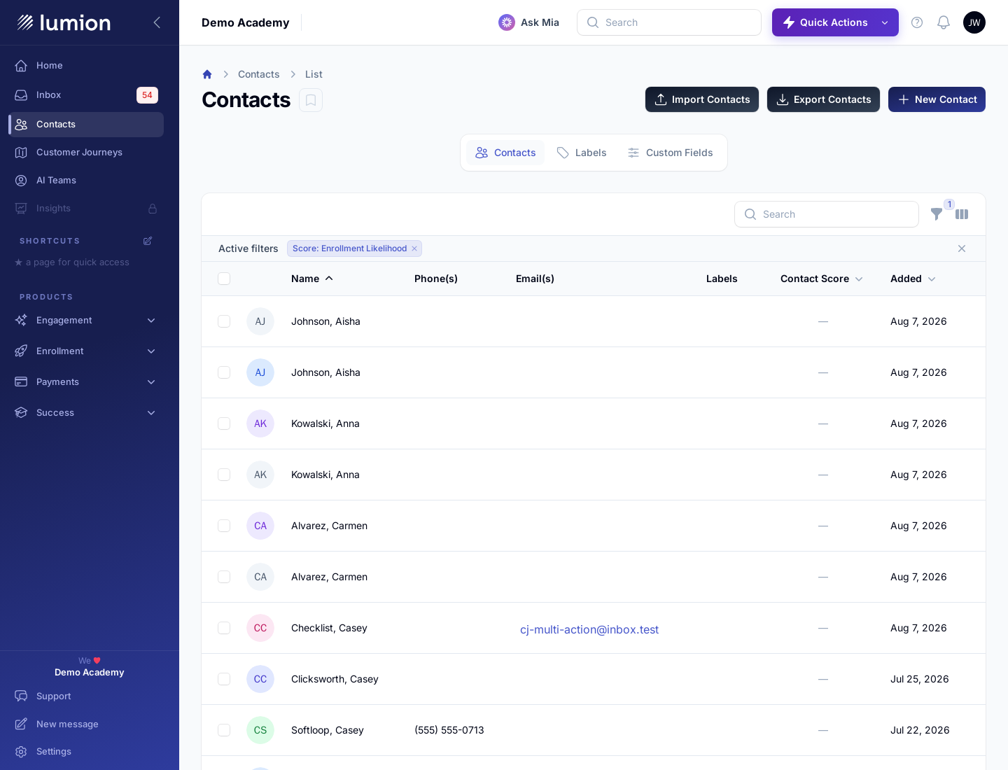
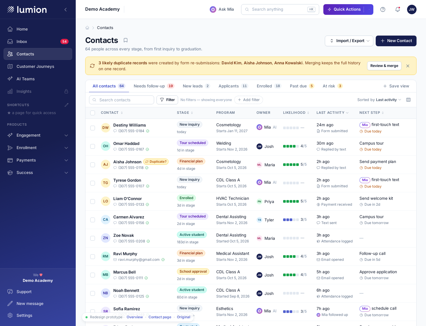
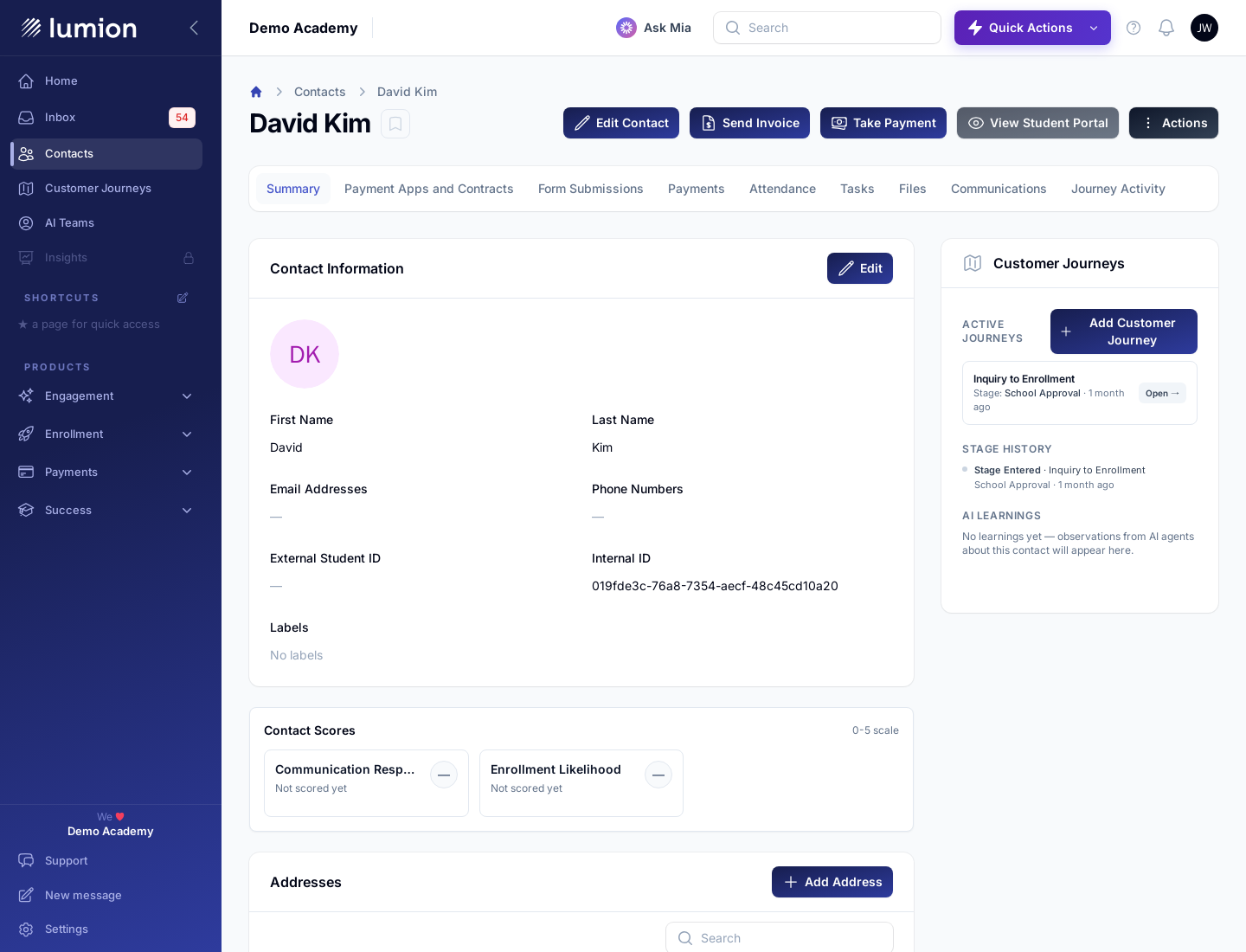
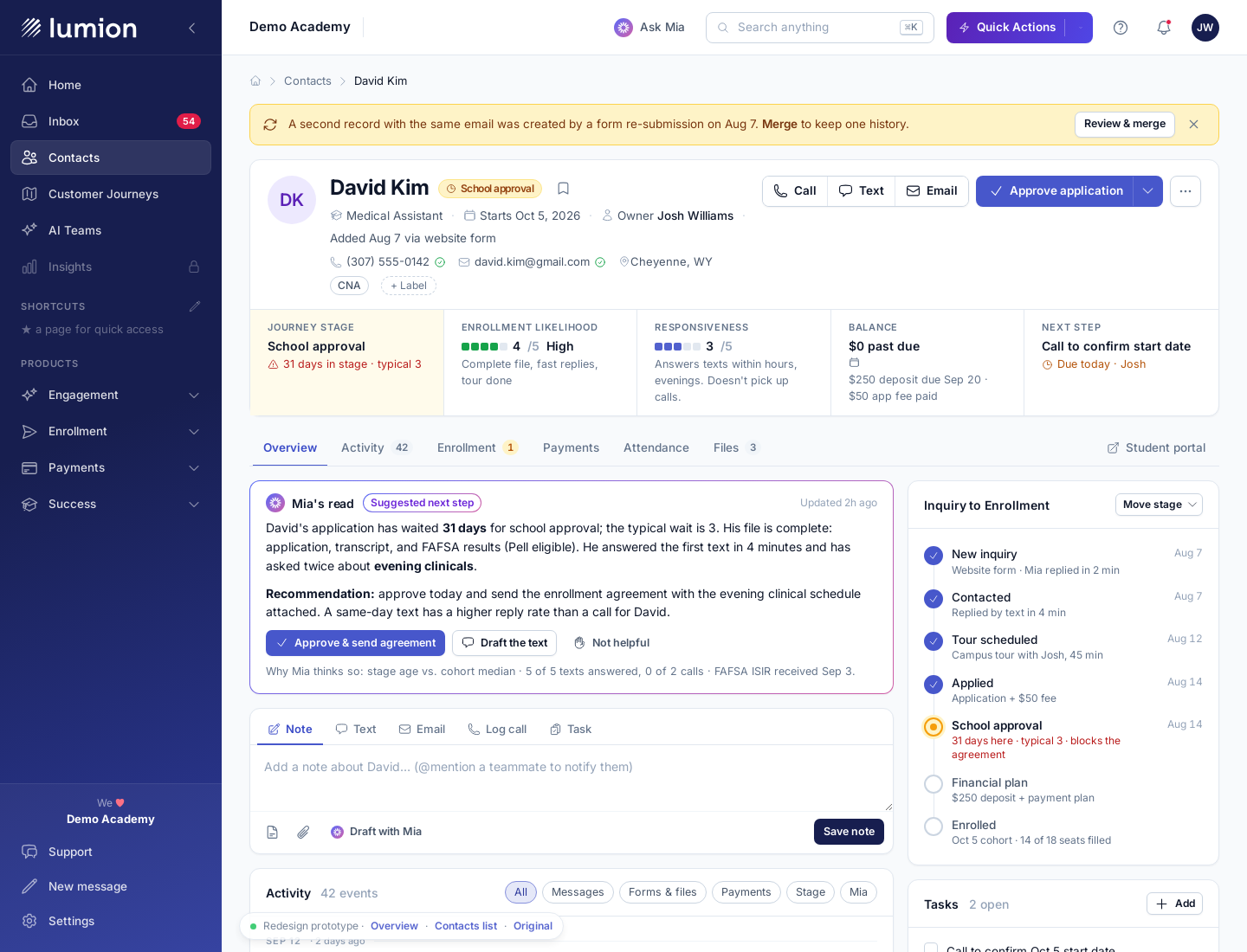
The untouched originals, for reference: contacts list and contact detail.